
Creating a delicious, fresh look made from scratch.
IDENTITY DESIGN | BRAND SYSTEM | REBRAND
OVERVIEW
Flour Child is a bakery located in downtown Grand Ledge, Michigan. Known for its delicious and fresh food, Flour Child is a family-owned business that is beloved by the people in Grand Ledge and surrounding areas.
Flour Child provides a rotating menu of pastries and baked goods made from scratch every day. Additionally, Flour Child also has a set menu of breakfast and lunch sandwiches and salads.
As a local small business, they also support other local businesses like Madcap Coffee Company and Boars Head Deli Meats to source their coffee and sandwich meats.
For this rebrand I set out to create a fresh new look for Flour Child Bakery, focusing on an identity that is modern and refined, yet emobodies the warmth and richness of fresh pastries.


THE BEGINNINGS
To begin this rebrand, I started with researching Flour Child and what draws people in to the business. Once I had a solid understanding of what makes Flour Child unique, I began brainstorming different ways to deliver that message.
BEHIND THE DESIGN…
Flour Child’s main draw is their fresh, made from scratch menu. In addition to this, Flour Child is a local small business that has welcoming and warm hearted staff. With this in mind, I wanted to create a design that encompassed these qualities that make Flour Child so appealing.
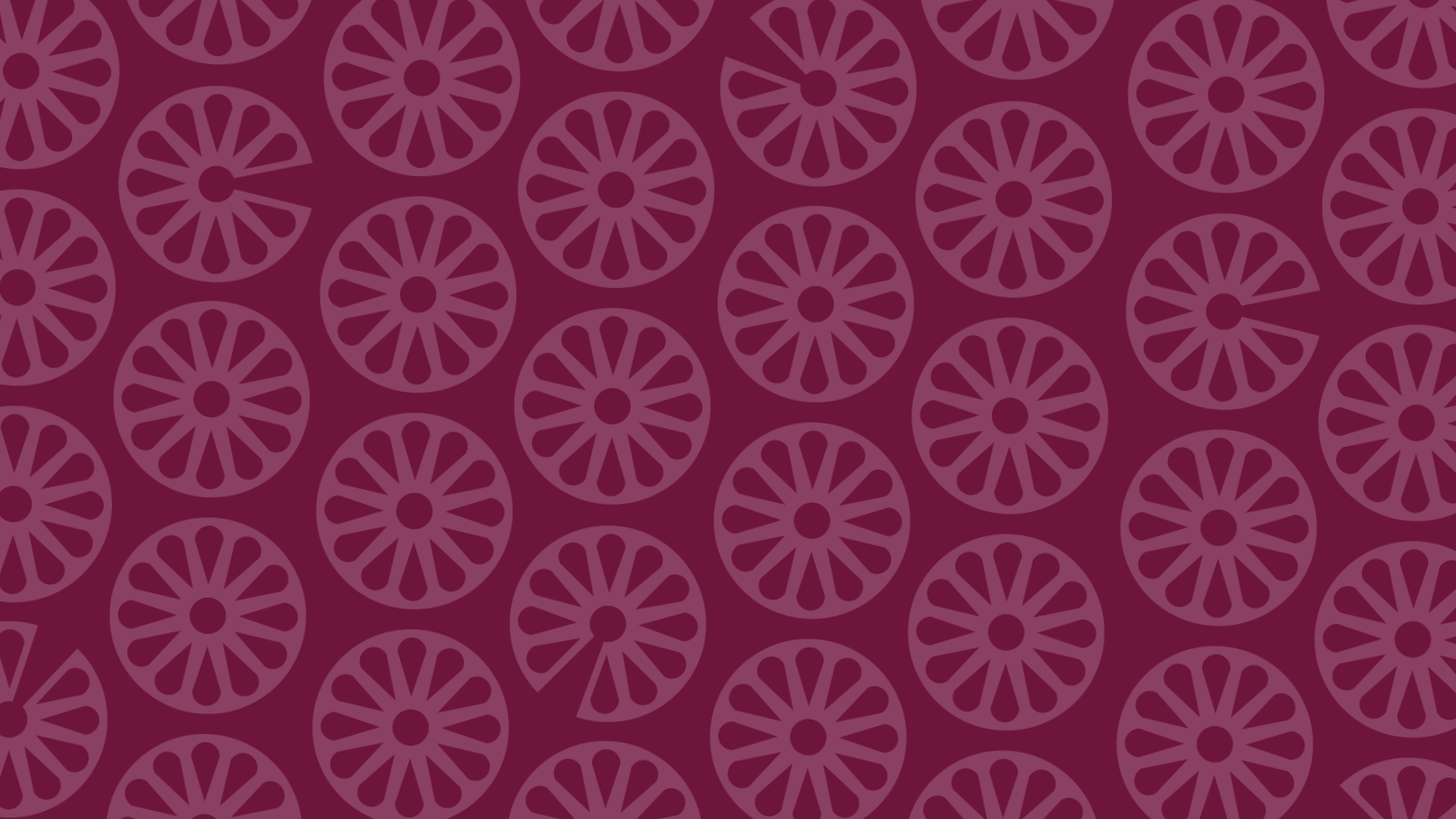
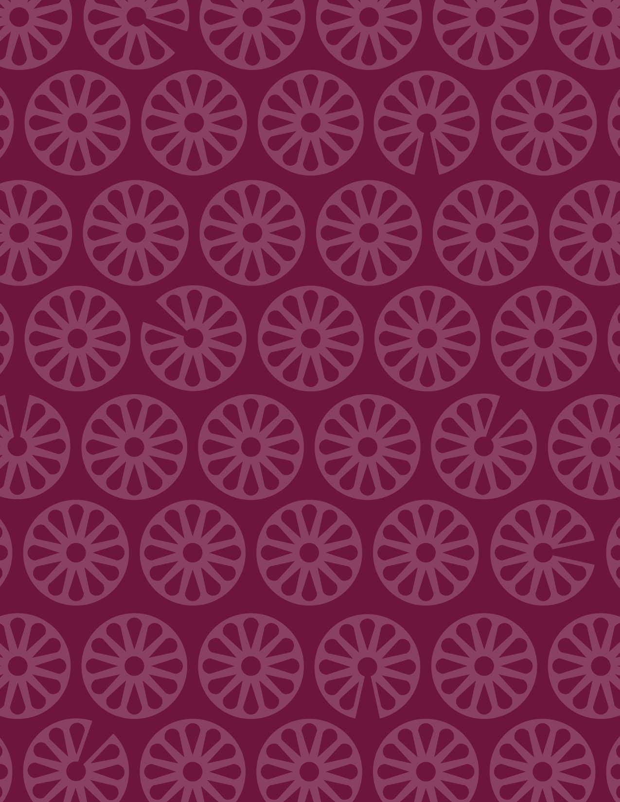
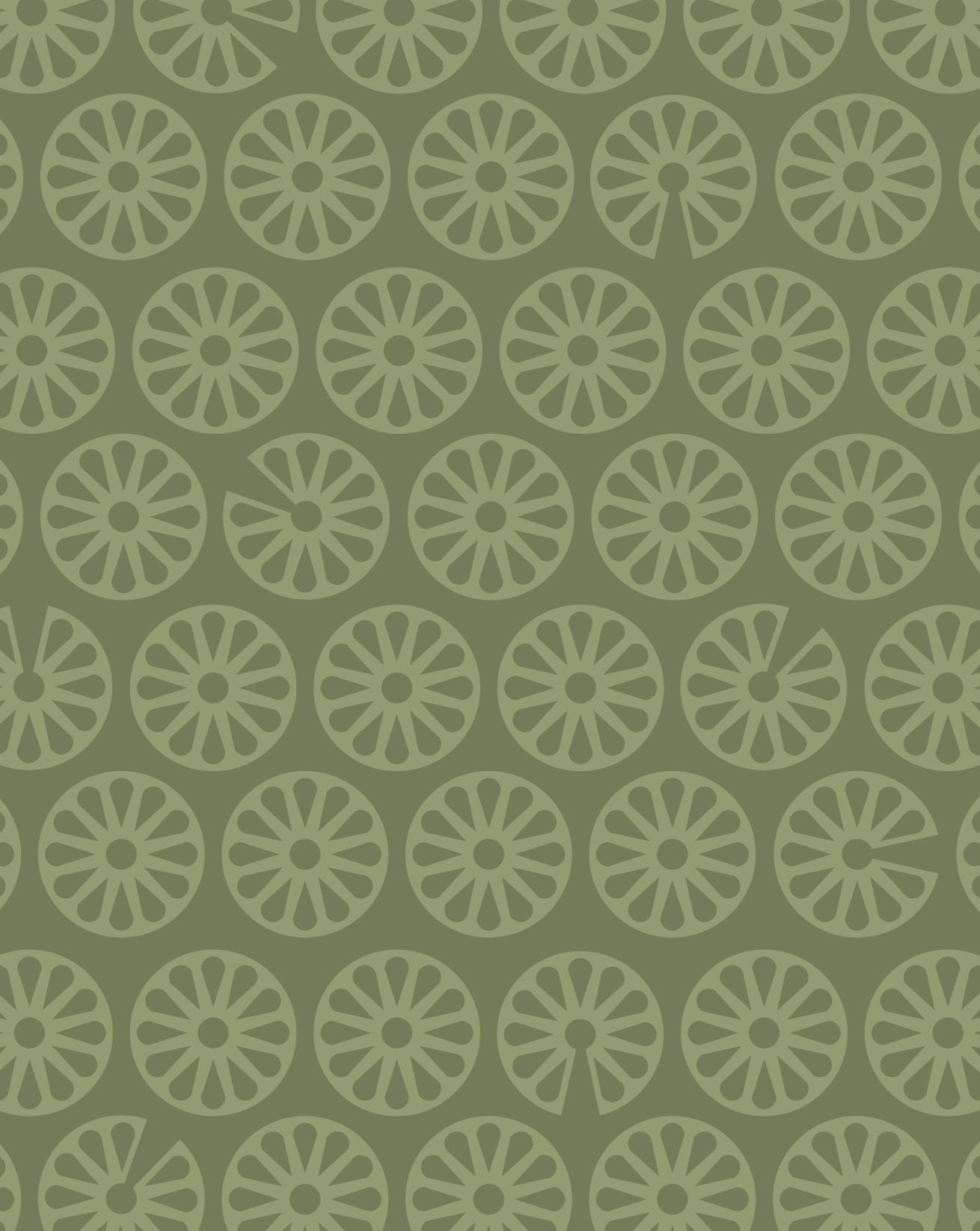
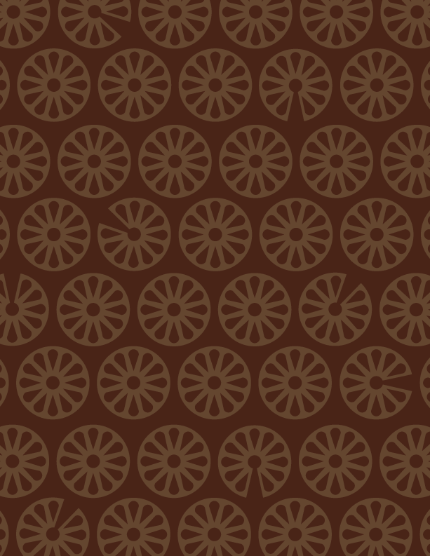
In the initial sketches, I wanted to utilize the play on words “Flour Child” contains. After many iterations, the resulting icon maintains the “flower” while also creating the illusion of a cake missing a slice.
The chosen color palette is inspired by florals and pastries. The deep magenta and light green are reminiscent of spring colors, however, they are slightly muted to better fit the palette. A dark brown color emulates the dark richness of chocolate and beige provides a neutral base to tie everything together.
THE COMPONENTS:
LOGO:
Flour Child integrated with primary icon
ICONS:
Primary and secondary icons
Representative of a flower and a cake
COLOR PALETTE:
Deep Magenta: Reminiscent of the color of flower petals
Light Green: Flower stems, fresh
Dark Brown: Warm, rich, emulates dark chocolate
Beige: Neutral color to tie everything together
TYPOGRAPHY:
Stolzl: Logo, Headings
Poppins: paragraphs
FROM CONCEPT TO CREATION
Once the base guidelines had been set, the only thing left to do was making the concept a reality.
When creating this rebrand, I had set off to conceptualize different items that may utilize the brand system that I had formed. While I had initially made mockups of anything I could think of, stationary items had drawn my attention the most.
For the stationary set I designed a business card, loyalty card, and envelope. These designs seek to integrate the logo, icon, and color palette of the brand system in a cohesive manner.
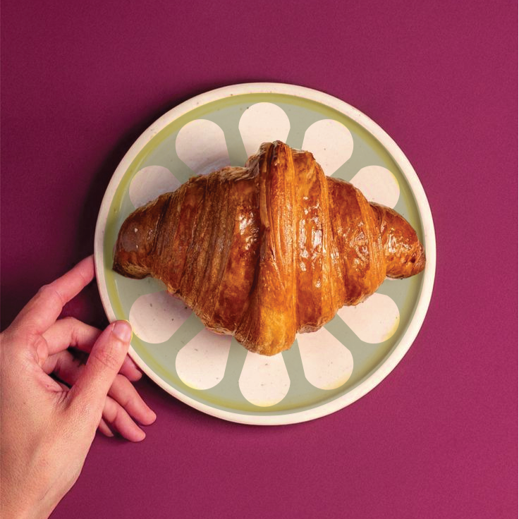
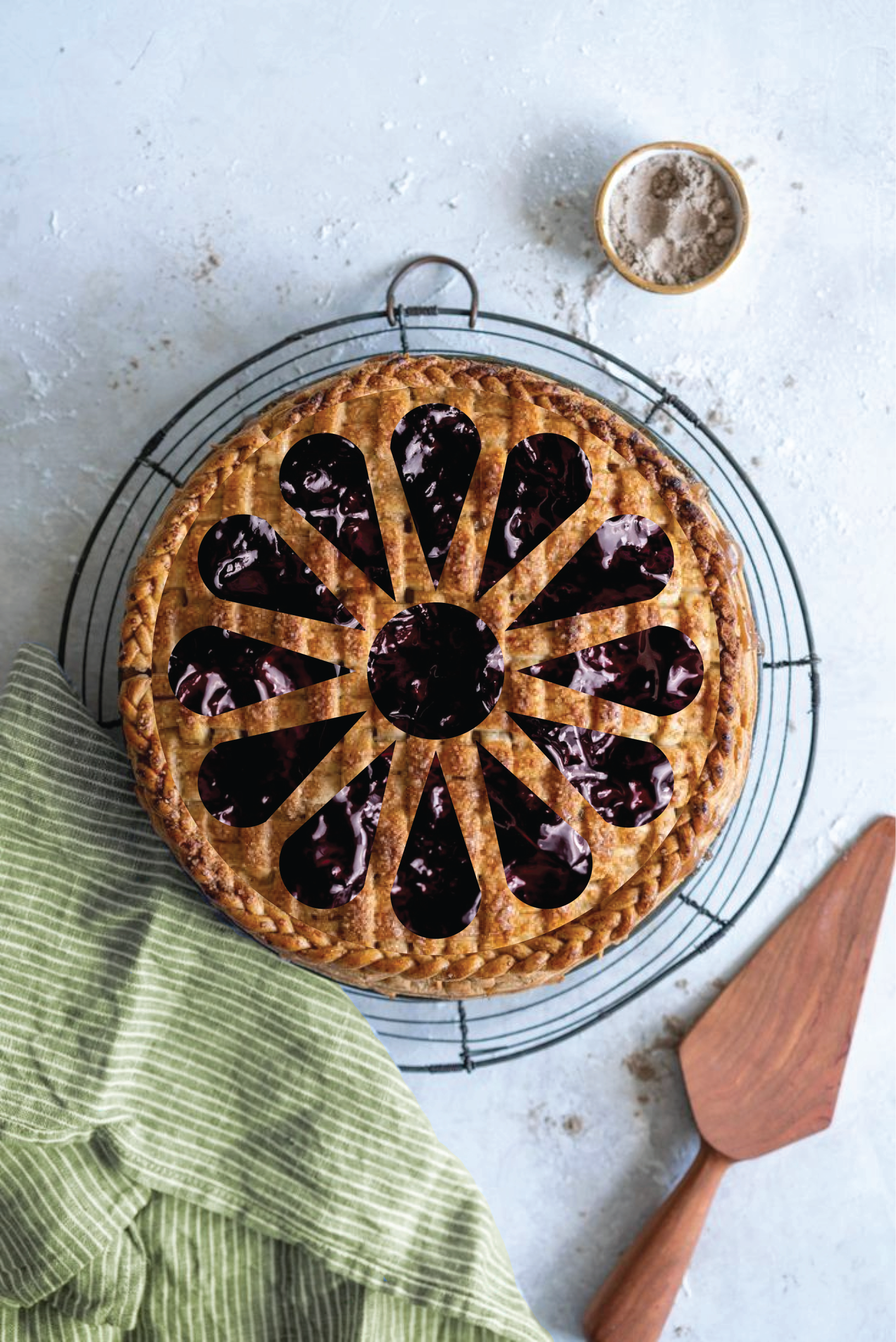
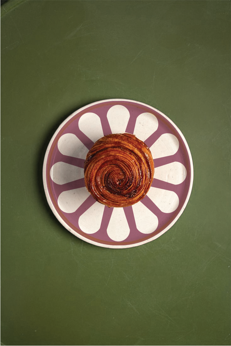
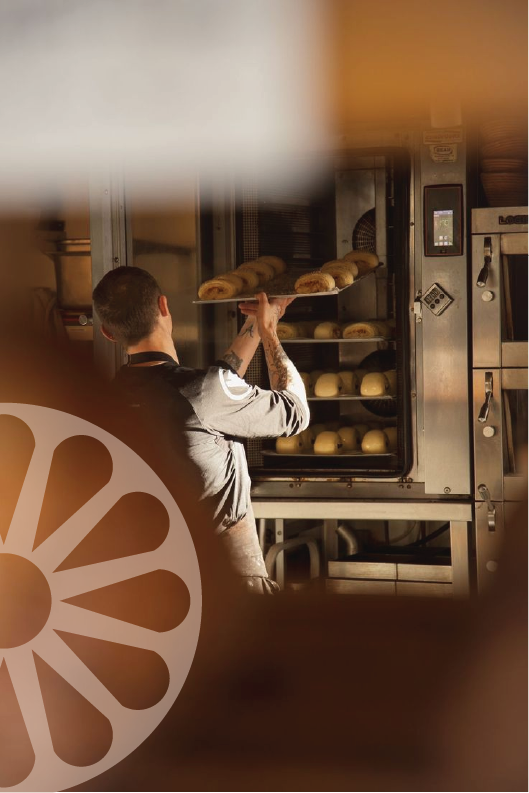
In addition to the designs of the stationary, I experimented with different ways the primary brand logo could be integrated in photographs.
With this investigation, I seeked a variety of ways the circular logo could fit into the bakery aesthetic. Plates, baked goods, and photo overlays are all diverse approaches to integrating the brand icon.